BAVC Media Has a New Look!
You might’ve noticed we look a little bit different!
Two years ago, we had some big news to share: The Bay Area Video Coalition (BAVC) was transforming into BAVC Media. Fast forward, and it’s been an incredible journey! We joined forces with Reel Stories and settled into our amazing space at Ninth Street Independent Film Center.
As part of this evolution, we’ve given BAVC Media’s visual identity a refresh to reflect who we are now as an organization.
We’ve been lucky to work with graphic designers, Ollie Eco and Martín Gaona, on tackling this design. We’re super excited to share our new look, which while it may have been updated, our mission remains the same. Stay tuned as we continue to roll out the redesign across our platforms!
“We saw this decision as meaningful to our development, with the primary objective of creating a design language that clearly connects BAVC Media with Reel Stories and SF Commons—San Francisco’s community media hub—around one cohesive visual identity, while still allowing for each program’s individuality. We want to share about our experience as a nonprofit media organization too – prioritizing design and communication is really hard to do on a limited budget, with a small team.”
– Paula Smith Arrigoni, BAVC Media’s Executive Director
Below is a summary of the process and the impact of the redesign with insights from Ollie Eco, the graphic designer behind the rebrand, as well as a few of our awesome staff members.
BAVC Media
Since 1976 BAVC Media has been a driving force for social change by amplifying voices and being a hub for creators. We empower media makers through art, education, and technology. With this rebrand, we’ll continue to inspire change through media empowerment in our existing community and strive to reach new audiences too.

“The two dots use the updated BAVC Media blue and represent the organization’s legacy in video and film. Our typeface of choice is Degular, used in our updated wordmarks and copy text. For BAVC Media we decided to go with all caps avoiding a drastic departure from the current wordmark. However, in the case of Degular, the neutral approach to its letters future proofs its usage and allows it to sit boldly (or quietly) as BAVC Media evolves and its brand changes.” – Ollie Eco
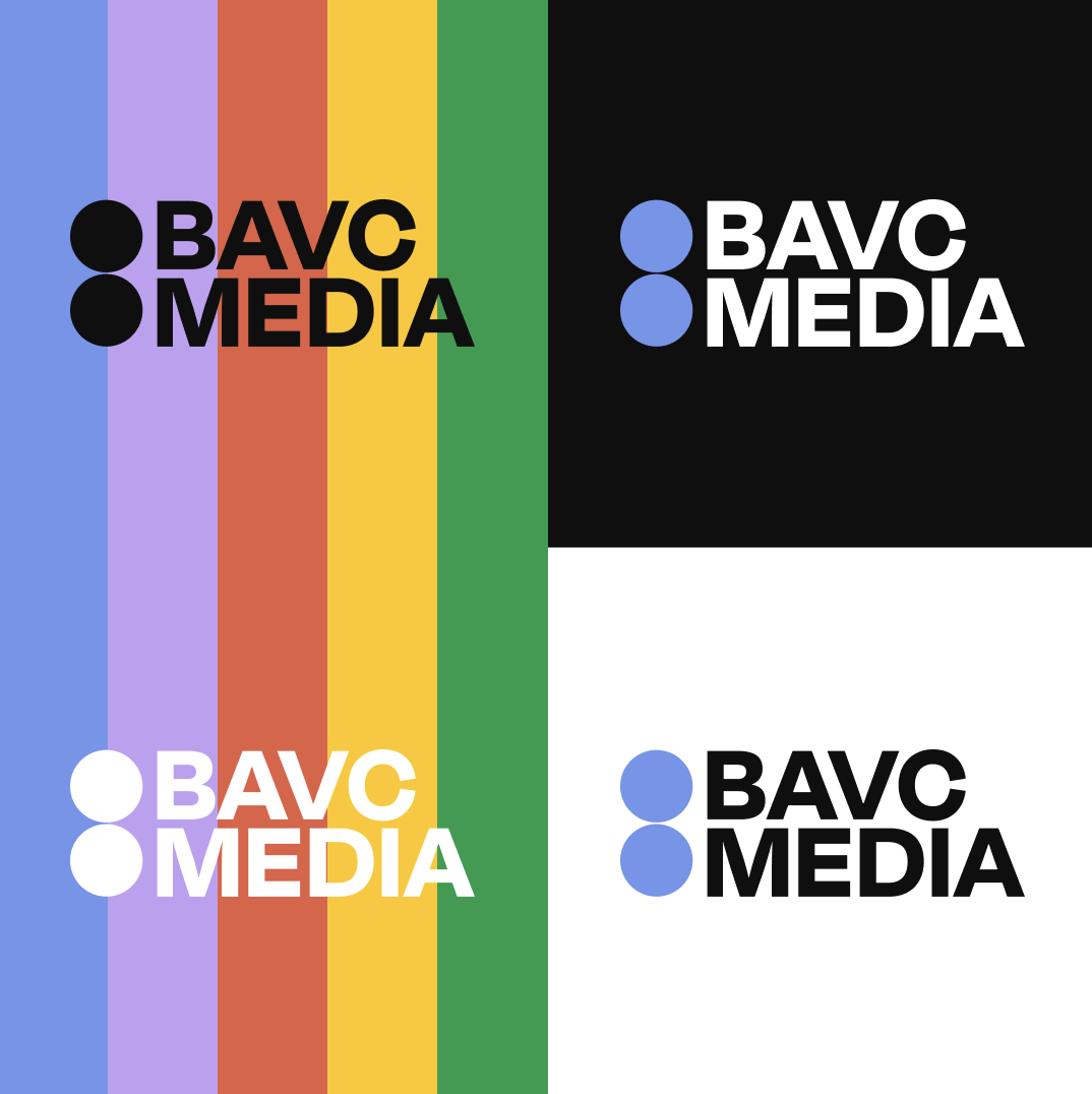
“The BAVC Media and Reel Stories color palettes have been refined in unison in order to make them feel in line with each other under one umbrella, while also maintaining individuality and autonomy” – Ollie Eco
Reel Stories
When women, girls, and gender-expansive filmmakers are better represented behind the scenes, they’re better reflected on the screen. That’s why Reel Stories is training the next generation of empowered filmmakers. Through collaborative, hands-on programs, we’re creating a pipeline of young women and gender-expansive youth with the skills they need to enter the film and media industry and the confidence they need to succeed.

“This rebrand brings Reel Stories even closer to BAVC Media, strengthening our connection with other programs across the organization. As a local independent filmmaker myself I know that these programs are important for developing the confidence and skills our youth need.”
– Dawn D Valadez, Director of Youth and Artistic Development
“Reel Stories is also set in Degular (similar to BAVC Media) but is set in lowercase letters, which enlivens the updated logo while maintaining brand cohesion with sister programs. The clapper board motif has also been reworked into the new logo to allow for brand recognition among existing community members.” – Ollie Eco
SF Commons
Public Access television has a vibrant and storied history in San Francisco. SF Commons’ mission is to offer San Francisco public access to local broadcast without barriers to the training and equipment they need to get their message out. We support multimedia and multiform storytellers who can catalyze social change and curate a diverse, creative local community TV channel that represents a diverse spectrum of voices and forms.
“With a new look, comes new innovation and inspiration. If you have a story you want to tell, you can start that journey here at SF Commons”
– Javan Jiles, Community Engagement Associate

“SF Commons in all caps makes several callbacks to BAVC Media’s logo—including the dot motif—but setting type to one line also gives the brand its independence while maintaining brand consistency among the other programs. The red dot uses the idea of being ‘on air’ as common for live television” – Ollie Eco
What to expect
You can expect to see our refreshed branding across social media, email, website, events and anywhere else you interact with BAVC Media programming.
